![knack-cx-logo-service-hub 1.png]](https://learn.knack.com/hs-fs/hubfs/knack-cx-logo-service-hub%201.png?width=419&height=40&name=knack-cx-logo-service-hub%201.png)
This article covers the following topics:
Where can I access grid column settings?
To access the column settings for a specific column in a grid view, simply hover over the column in the page preview and click on the pen icon to edit:
/Grid%20Column%20Settings/columnsettings1.png?hsLang=en)
This action will open the column settings in the toolbox located on the left side of the grid preview. Once in the column properties, you'll be able to customize the properties, layout, display rules, and design settings for the column.
Tip: To learn more about grid view settings, find more information in our Grid View Settings article.
Column Properties
In the properties section, you can modify basic information about the column and its functionality.
Within this section, you can control the following settings, depending on the configuration of your grid and the types of fields used:
-
Page to link to: If the column contains a link to a page, the page will be shown here.
-
Field: This displays the field that is utilized for that column. Editing the field for the column is not currently possible.
-
Header: The text that is utilized as the column header.
-
Grouping: Specifies a specific field to be utilized for grouping the grid.
-
Group Order: Specifies the order in which the grouped field will be sorted.
-
-
Link Type: Select whether to use custom text or a field value for the link text.
-
Link Text: Specify custom text to be used as the link.
-
Link Field: Choose a field to display as the link.
-
-
Icon: Include an icon to represent record links for viewing, editing, and deleting records.
-
Connection Link: If you are using a connected field, you have the option to enable this field to link to another related page in your app.
-
Connection Separator: For connection fields that have numerous connected records, you have the option to specify how these values will be separated, either by using a comma or by displaying them on a new line.
-
-
Truncate Text: If you are working with a paragraph field type, you can truncate the text if needed.
-
Character Limit: When the "Truncate Text" option is enabled, you can specify the maximum number of characters allowed in the field.
-
Allow inline editing: Deactivate/activate inline editing for the specific field column in the grid. This option only is shown if inline editing is enabled in the grid's settings and the field is not an equation, auto increment field, text formula, or formula field.
-
Allow summary: Deactivate/activate column summaries for a specific field.
Page to Link to
For columns that contain action links to view or edit the record, this will specify the page within the app that the column links to. This field cannot be edited, but clicking the link will take you to that page within the Builder.
/Grid%20Column%20Settings/gridcolumnsettings2.png?width=688&height=279&name=gridcolumnsettings2.png)
Field
The “Field” option in the properties will display the name of the field shown in that column. When editing columns, the field name is not editable and can only be changed by changing the name of the field in the Data section of the Builder.
Connected fields will display with the connected table's name followed by the connection field's name:/Grid%20Column%20Settings/columnsettings3.png?hsLang=en)
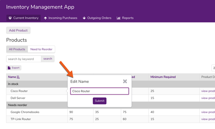
Header
The name of the column header will default to the name of the field in the table, but can be changed in the editor:
/Grid%20Column%20Settings/columnsettings4.png?hsLang=en)
The header text will display as the column header in the Live App (and in the Builder preview of the grid).
Grouping
To organize your records based on a shared value in a specific Grid column, you can select the "Grouping" option when editing the column. This allows you to specify which column(s) should be used for grouping.
/Grid%20Column%20Settings/columnsettings5.png?hsLang=en)
Once grouping has been enabled, a “Group Order” option and “Group Position” option will be available.
The “Group Order” allows you to define how you will sort your grouped records. The “Group Position” allows you to define in which order records will be grouped if more than one group is used.
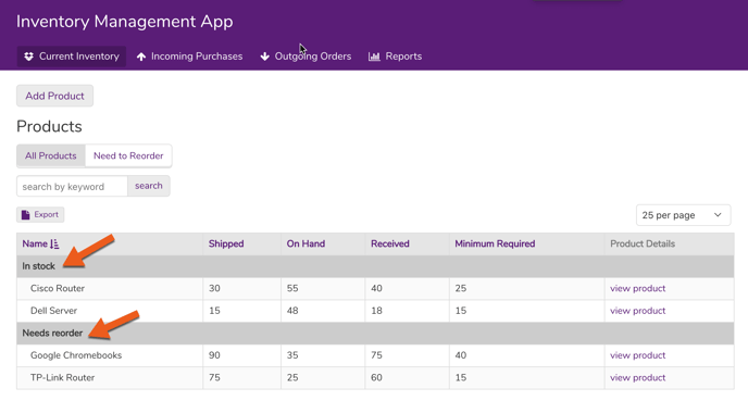
Any columns with grouping enabled will be automatically moved to the front of the grid. Here is an example of Products being grouped by an "In stock" field:
Note: If your grid is displaying any row summaries, such as totals or averages, those will also be displayed for the first level of each group.
Link Type
For columns that contain record links to view, edit, and delete the record, it's possible to show either text as the link or a specific field value.
Choosing “Text” will allow you to use custom text for that link. Whereas, using “Field” will allow you to select a specific field in that table which can be used for the link.
/Grid%20Column%20Settings/columnsettings6.png?hsLang=en)
Icon
For columns that contain record links to view, edit, and delete the record, it's possible to add an icon along with the text. Here, you can select the icon to show along with the link.
/Grid%20Column%20Settings/columnsettings7.png?hsLang=en)
Connection Link
When adding fields from connected records, you can display these field values as a link. The value links allow you to link to another page in your app which can display these connected records. This option is only available under connected field columns.
/Grid%20Column%20Settings/columnsettings8.png?hsLang=en)
Connection Separator
When adding fields from connected tables that have multiple connected records, you can choose how multiple values will be displayed in your grid. They can either be separated by commas or listed on a new line.
This option is only available under connected field columns.
/Grid%20Column%20Settings/columnsettings9.png?hsLang=en)
Truncate Text
When using paragraph fields in a grid column, you can choose to truncate the text. This will limit the number of characters which are shown in the paragraph field for each record.
/Grid%20Column%20Settings/columnsettings10.png?hsLang=en)
Allow Inline Editing
Inline editing allows the user to edit each field directly in the grid without having to use a form view to update the field values. To enable inline editing for your grid view, click on the "Inline Editing" checkbox under "Options".
/Grid%20Column%20Settings/columnsettings12.png?hsLang=en)
When enabled, users can click on a grid cell and a form pops over it to edit the field's value:
Once inline editing has been enabled, it will enable editing for all columns except equations, text formulas, formulas, and auto increment field columns. You will need to manually disable inline editing for each column.
To disable inline editing for an individual column, you can edit each grid column to be directed to the column properties. Once there, select the "No" radio button for "Allow Inline Editing" and save your changes.
/Grid%20Column%20Settings/columnsettings11.png?hsLang=en)
Note: Once a field has one or more conditional rules, you will not be able to edit records inline. This is because conditional rules can supersede any values that have been set manually.
Allow Summary
When column summaries are enabled on a grid view, this will show a summary row below the grid for all number fields. The option highlighted below will allow you to enable/disable the row summary for each number type field.
/Grid%20Column%20Settings/columnsettings13.png?hsLang=en)
/Grid%20Column%20Settings/columnsettings14.png?hsLang=en)
Design
From the Design section, you can adjust a column’s width and change the alignment of records:
/Grid%20Column%20Settings/columnsettings15.png?width=688&height=354&name=columnsettings15.png)
Column Width
Choose either a default width for your column or you can use a custom width of your choosing. The default width is based on the field name's length.
You have two options for setting the custom width of a field:
-
Pixels: Define the width of the field in terms of pixels.
-
Percent: Define the width of the field in terms of percent of the page. For example, entering "20" would make the column 20% of the width of the page.
Note: You cannot make a column's width smaller than the width of the column's header or the longest continuous string of characters in a field value (Example: A long link or file name).
Align
This setting will align the data in that column based on your choice. You can choose to have data aligned to the left, center, or right.
/Grid%20Column%20Settings/columnsettings16.png?hsLang=en)
Rules
Display Rules
Using display rules, you can add rules to update the column's display:
/Grid%20Column%20Settings/columnsettings17.png?hsLang=en)
A display rule is added by defining the conditions (if) that trigger the actions (then):
If: The condition(s) that will trigger the actions when the condition is true. More than one condition can be added to trigger the action, in which case, every condition must be true.
Then: The action to trigger when the condition is met. There are five actions that can be triggered by display rules:
-
Set Text Color
-
Set Text Style
-
Set Background Color
-
Display Icon
-
Hide Value
Tip: You can learn more on using display rules here.
Record Actions
Using record actions, you can add rules to:
-
Update this record
-
Update connected records
-
Insert a connected record
-
Send a custom email
Note: Record actions will not be available for a column if inline editing is disabled.
/Grid%20Column%20Settings/columnsettings18.png?hsLang=en)
Tip: To learn more about using record actions, see our article here.