![knack-cx-logo-service-hub 1.png]](https://learn.knack.com/hs-fs/hubfs/knack-cx-logo-service-hub%201.png?width=419&height=40&name=knack-cx-logo-service-hub%201.png)
This article covers the following topics:
What are grids?
Grids are a versatile view that allows you to showcase multiple records from tables in your Live App. Each column in the grid represents a field in a table, while each row corresponds to an individual record.
Grids can also include action links that allow users to access more information about a record, make edits or deletions to individual records displayed in the grid, or initiate specific actions.
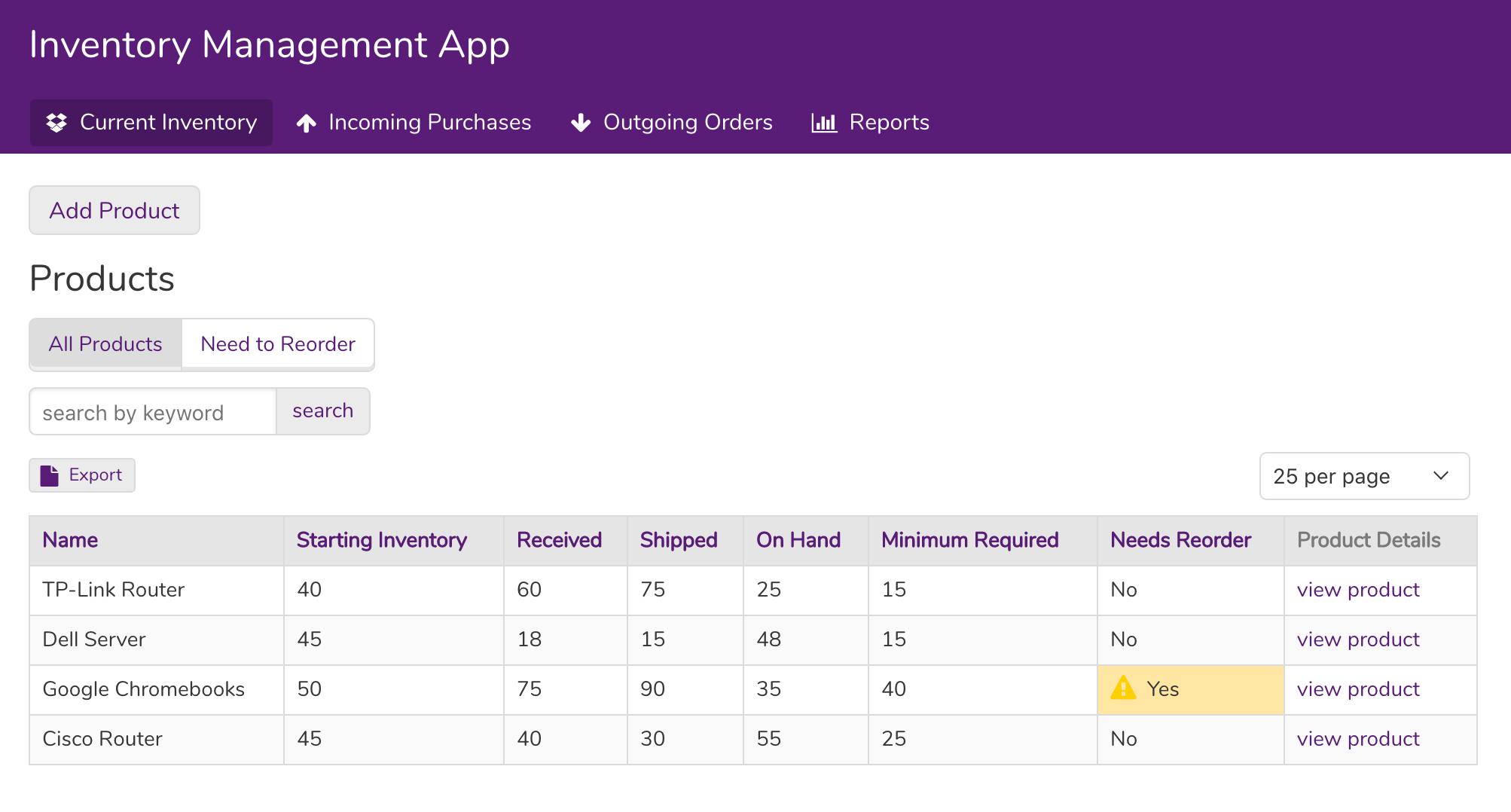
What do grids look like in the live app?
In the Live App, a grid is displayed as shown below. The fields from the table are used as columns in the grid, and the records are displayed as rows.
Managing Grids
Adding, editing, and deleting views are managed the same regardless of view type. To learn how to add, edit, and delete grid views from your app, see our article About Views.
Where can I access grids?
To access your grids, navigate to the Pages section of the Builder. From there, you have the option to add a new grid or select a page that already has a grid view.
Once you've selected a grid view, you can easily edit it in the page preview.
/About%20Grid%20Views/grids2.png?hsLang=en)
Grid Settings
To access the view settings, simply click on the grid view in the page preview after adding it. This will open the view editor in the left side-toolbox.
/About%20Grid%20Views/grids3.png?hsLang=en)
The grid settings have the following sections:
-
Source: Control which records display in the grid.
-
Settings: Control the pagination, filters, and options such as adding, exporting, and inline editing.
-
Add Columns: Choose which columns and links to display on your grid.
Tip: To learn more about grid settings, see our article here.
Source
The Source section provides information on which table the view is displaying and is used to determine which records the grid will show and how they will be presented.
The following sections are available in the Source settings:
-
Data: Add rules to define and limit which records will be displayed.
-
Sort: Define the sort order in which records will be displayed.
-
Limit: Specify the number of records to be displayed. If you prefer to showcase a specific number of records instead of displaying all of them, you have the option to set a limit.
-
For instance, if we are interested in showcasing our top 10 prospects, we can simply set the limit to 10.
-
/About%20Grid%20Views/grids4.png?hsLang=en)
Tip: To learn more on working with the view's source, see our article here.
Settings
The Settings section is where you will find the settings for your grid to manage how elements of your grid will behave.
/About%20Grid%20Views/grids5.png?hsLang=en)
Options
The Options section contains four features that you can enable to customize your Grid view:
-
Keyword Search: This adds a search field above the grid for users to filter records by entering keywords. A "reset" link appears on the search results display to easily clear search criteria and start a new search.
-
Exporting: This adds a link above the grid and allows the user to export all the data from the grid into either a CSV, JSON, or TXT format.
-
Inline Editing: This allows the user to edit each field directly from the grid, without utilizing a form view.
-
Hide Empty Columns: Enabling this feature will hide all columns that are empty from the grid view.
Empty Grid Text
Here you can change the text that is shown when the grid has no records to display.
By default, this will show “No Data.” Add your own text here to add custom text for empty grids.
/About%20Grid%20Views/grids19.png?hsLang=en)
Column Summaries
Column summaries are a valuable tool for performing calculations on all the rows in a column. The results of these calculations are then displayed as a summary at the bottom of the grid columns.
Within the grid settings, you have the option to add four different types of column summaries: Sum, Average, Minimum, and Maximum. This allows you to customize the summary information that is displayed in your grid view.
To add column summaries click the “Add Summary” button. Then add a title for your summary and select the summary type. By default the title is “Total” and any label you add will be placed in a left column if available.
/About%20Grid%20Views/grids6.png?hsLang=en)
If you want to turn off row summaries for certain columns, you can simply hover over the column in the grid preview and click on the "more options" icon.
Select "No" in the Allow Summary dropdown to hide the summary for that column.
/About%20Grid%20Views/grids7.png?hsLang=en)
Pagination
Pagination controls the number of records displayed on your grid at one time. If the total number of records exceeds the set limit, a pagination control menu will be added to the grid, allowing users to navigate to additional pages and view more records.
/About%20Grid%20Views/grids8.png?hsLang=en)
-
Set how many records to display at a time: Grids can be set to show 10, 25, 50, or 100 records at a time.
-
Let the user change the amount: Once the live app page has loaded, the user will be able to select how many records they will view per page. They can choose between 10, 25, 50, 100, 500 or 1000.
-
Repeat pagination controls below the view: This will show the buttons to navigate to different grid pages at the bottom of the grid as well.
Here's an example of a grid displaying pagination links in the top right:
/About%20Grid%20Views/grids20.png?hsLang=en)
Filter Options
Filter options provide you with the flexibility to customize how your users can filter the records in the Live App. In this section, you have the ability to disable filters for the user, allow users to add their own filters, or incorporate a predefined filter menu.
Don't allow records to be filtered: Selecting this option will prevent users from filtering the records in the grid view in the Live App.
Allow users to add custom filters: Enabling this option allows users to add custom filters in your grid when they access your app. Users will be able to select which field and criteria they want to filter by.
Here, users can filter all fields and tables or limit the available filters to specific records and fields. They can choose to filter by all table fields or only the fields displayed in the view.
Internal filters can also be added to restrict the records returned by these filters.
This option will display in the Live App (and in the Builder preview) as an "Add filters" link above the grid:
/About%20Grid%20Views/grids9.png?hsLang=en)
The grid will automatically update when a filter is added to the Live App, and you can add multiple filters as required. Additionally, you have the option to specify whether the available fields for filtering are limited to the grid columns or include all of the grid fields.
Note: When restricting filters to only show the fields that are used as grid columns, any fields used in a display rule for the grid will also show as an available field in the filters.
Using a Filter Menu
Enabling a filter menu will display links with predefined filters above the grid. These filters cannot be modified by the user in the Live App.
By clicking on the filter menu links, the records will be filtered based on the rules that you have established. The user can then click on the menu links to automatically filter the records.
/About%20Grid%20Views/grids10.png?hsLang=en)
Note: If rules were added to the grid's Source, those rules will be combined with any filters that are added.
Title & Description
In this section, you have the ability to personalize the grid's title and include a description. This provides users with additional context about the content displayed in the grid, enhancing their understanding.
-
Title: The text located here will display as the main title above the grid view.
-
Description: Here, you can add additional description text that will display below the title.
/About%20Grid%20Views/grids11.png?hsLang=en)
Adding Columns
The Add Columns section defines which fields will show as columns and which action links will be included on the grid.
/About%20Grid%20Views/grids12.png?hsLang=en)
In this section, you have the ability to add or remove fields from the primary table that the grid is displaying, as well as fields from connected tables. You can simply click or drag these fields onto the grid view to customize the grid's data content.
Managing Columns
Each individual field that you can add to the grid is linked to a field in your table or a connected table.
Fields
In the Fields section, you can find all the fields from the primary table that the view is displaying. Simply click on a field or drag it onto the grid preview to add it as a column.
When the field is selected and not dragged and dropped, it will be added to the right of the grid as the last column by default.
In the Connections section, you can add fields from connected tables. To add these fields click on a field or drag it onto the grid preview to add it as a column:
/About%20Grid%20Views/grids13.png?hsLang=en)
Tip: Tables will first need to be connected in the Data section of the Builder before this option will become available.
Actions
Within the Add Columns section, you have the ability to manage action links, which enable you to include additional link columns in your grid view. This is where you can incorporate links to remove a record, modify a record, access more details about a record, link to another related page, or activate an action.
/About%20Grid%20Views/grids14.png?hsLang=en)
-
Edit record: This action will generate a new child page featuring a form to modify the record. By clicking on the link, users will be directed to this page to make edits to the record.
-
View record details: This will create a new child page that displays all further details for the record. Clicking on the link will go to that page to view those details.
-
Delete record: This adds a delete link that when clicked, users will be prompted to confirm deletion. Selecting yes will remove the record from the grid and delete the record from the table.
-
Link to another page: Instead of creating a new page for this grid, you can link to an existing page that you've already created. For instance, if you have a comprehensive page that displays details about a company record, you can simply link to that page.
-
Trigger an action: Action Links provide the ability to create a link within the view that can trigger various actions such as updating the record, updating connected records, inserting connected records, sending emails, redirecting to another URL, or displaying success messages.
Tip: Learn more about using action links in our article here.
Editing Columns
To edit a field column, hover over a column in the page preview while editing the view and click the pen icon.
/About%20Grid%20Views/grids15.png?hsLang=en)
The toolbox will then display options to edit the column's properties, display rules, and design settings.
Deleting Columns
Hover over a column and click the "trash can" icon to delete the column:
/About%20Grid%20Views/grids16.png?hsLang=en)
Moving Columns
To rearrange field columns on the grid view, simply click on the header of the desired column and drag it to the left or right to position it where you want it to be. You'll see a crossbar icon appear as displayed below:
Using Grids in Your App
Tables and Connected Records
Furthermore, you have the capability to incorporate field columns from connected tables in addition to displaying fields from the table used to create the grid view. This feature enables you to showcase records from multiple connected tables within a single grid.
In the Add Columns section of the grid settings, you will find fields from connected tables in the “Connections” section.
/About%20Grid%20Views/grids18.png?width=688&height=462&name=grids18.png)
From here, you can add columns to your grid in the same manner as you would add fields from the primary table. Users have the option to easily drag and drop these connection fields to their desired positions within the grid view.
Alternatively, they can simply select the fields, which will automatically add them to the furthest right position within the columns.
Note: These additional fields will only be available to select if the tables are connected in the Data section of the Builder.
Notes & Troubleshooting
-
If you add a new field to your table, it will not be automatically added to your grid. You must manually add the field to your grid columns in order for it to be displayed.
-
If you delete a grid, all child pages connected to the grid will also be deleted, unless the child page is connected to other views.
How To Guides
Here are several guides that use grid views to display records:
-
Show records connected to the logged-in user's company or other groups.
-
Track customer orders in a grid in an Orders App.
-
Display inventory reports in an Inventory Manager or Warehouse Manager app.
-
Keep track of edit logs with a Version Control History for Records.