Grids and searches let you handle simple reporting needs with grouping and totals while providing flexibility for your users to customize the data with filters.
Report views let you group data to see trends and compare values - a line chart displaying revenue growth or a pivot table grouping product orders by month can tell a powerful story.
You can combine these views to create reporting dashboards and utilize formulas and equations to reveal deeper stories about your data.
Grids & Searches
Many features in grids and searches can be enabled to convert a simple view to a powerful reporting tool.
The key difference between grids and searches is that with a grid view, the user has a starting point for their report. They start with a grid view displaying their records and can drill down from there.
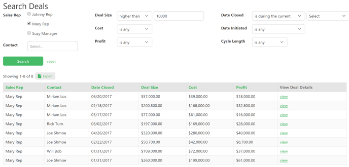
With search views, the user can generate a new, high-customized report on the fly using the granular search filters. The results are then displayed in a grid format which can have all of the customizations available in a regular grid view.
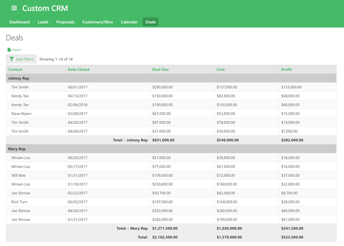
For example, a sales manager can use a grid to view the current deal pipeline grouped by sales rep. Row summaries calculate the pipeline per grouping and in total.
The manager has the option to add further filters to this report to drill down.
Learn More:
- About Search Views
- About Grid Views
- Source: Which Records Will the View Display
- About Exporting form the Live App Reports and Printing Pages
- Any export will keep the filters your users apply, but not the groupings and calculations.
Pivot Tables
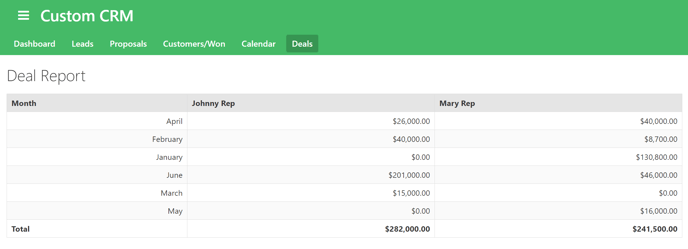
Pivot tables give you the ability to perform calculations on two groupings at once, the rows and columns.
In this example, a sales manager can see sales per sales rep per month.
Learn More:
Line, Bar, & Area Charts
Line, bar, and area charts provide a visual comparison of categorical data. They give you an easy way to compare values and view progression at a glance.
- Line charts show calculations based on a single grouping as a plotted line.
- Bar charts show calculations based on a single grouping as bars.
- Area charts fill in the area below the data points on a line chart and can help to visualize trendlines.
Let’s go over some ways you can use bar and line charts in Knack:
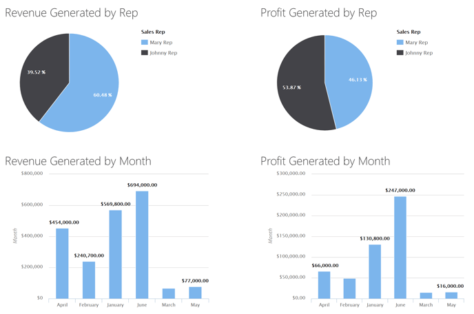
- Allow sales managers to view revenue breakdown by sales rep and month (screenshot below).
- Allow companies to compare sales of their different products.
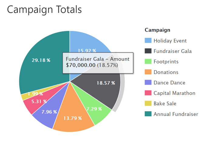
- Allow nonprofits to see how each campaign contributed to the overall amount of money raised over a certain period of time, while also seeing the total accumulated amount.
In our Purchase Orders sample app, a horizontal bar chart is used to compare total orders by vendor.
Pie Charts
Pie charts are used to illustrate proportion and see relative popularity. They show calculations as percentages of the total, based on a single grouping.
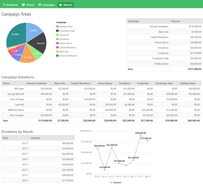
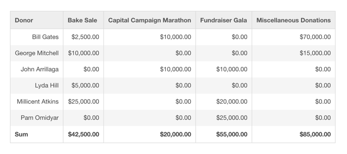
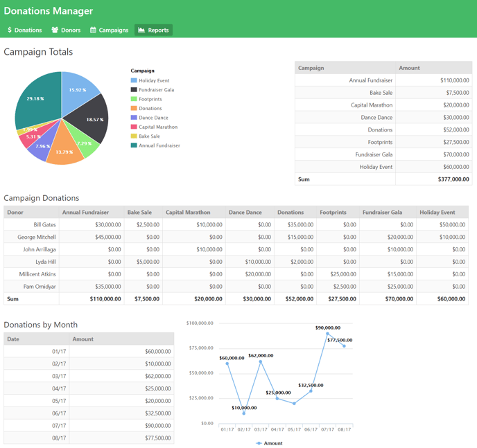
For example, in our Donation Campaign Manager app, we use pie charts to compare the donation totals by the campaign. This helps us see which campaigns are the most popular.
Learn More:
Dashboards
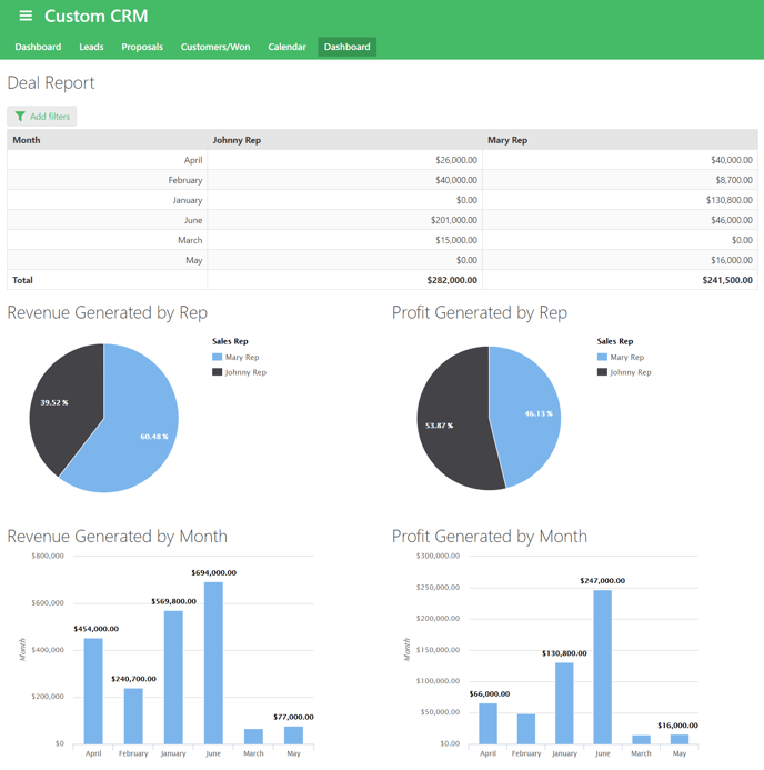
In Knack, you can layer grids, searches, and report views together on a single page to create a dashboard.
Dashboards are a common and useful tool for sales organizations. A sales manager may want to see their sales reps’ performance by profit generated by month, a breakdown of who is contributing most to revenue and profit, and a visual representation of what months are the busiest.
You can also see an example of a dashboard in our Donation Campaign Manager sample app. In this app, there is a dashboard around donations received - what campaigns they come from, who the biggest donation sources are, and what months are the busiest for donations.
Calculations
Formulas and equations are critical reporting tools in Knack. Rather than being calculated on a view level, like grid row summaries, formulas and equations are calculated on the record level.
Formulas and equations are valuable for automation. They are updated any time related records are updated or added, ensuring you always have current values in your database.
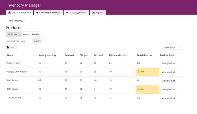
For example, we use calculations in our inventory manager app, to keep current stock levels up to date automatically.
Learn More: