![knack-cx-logo-service-hub 1.png]](https://learn.knack.com/hs-fs/hubfs/knack-cx-logo-service-hub%201.png?width=419&height=40&name=knack-cx-logo-service-hub%201.png)
This article covers the following topics:
What is a menu view?
A menu view serves the purpose of showcasing links to additional pages within your application or external websites.
Menus are a handy tool for organizing multiple pages and views. For instance, if a page becomes too cluttered with a grid listing numerous records and a form to add a new record, you can simplify navigation for users by linking to the form view from a menu view.
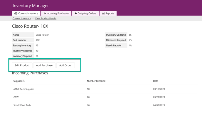
What do menus look like in a Live App?
This Menu is positioned below a Details view and provides the functionality to open modal popups for users to conveniently edit or add records.
Managing Menus
To learn how to add, edit, and delete views from your app, see our About Views article.
Menu Settings
To access the settings of a menu view, simply hover over the view and click on the pen icon that appears at the top left corner.
In the menu settings, you can edit aspects of the menu such as the title, description, format, and design of the menu view:
/About%20Menu%20Views/menuview1.png?hsLang=en)
The following are the various options available in the menu view's settings:
-
Link to a new page: This option allows you to easily create a link to a new page within your app. You will be guided through the setup process to add your new page.
-
Link to an existing page: This option allows you to add a link to a page that already exists in your app. You have the flexibility to choose another parent page or a page that originates from a menu view on a parent page.
-
Link to a URL: This option allows you to include a link to an external website.
-
Title: This option allows you give your menu view a title that will appear above the view.
-
Description: This setting will appear alongside the title above the menu view. Descriptions provide valuable context to users about the links in the menu view.
-
Tabbed Menu: Menus can be customized to show as buttons or tabs. By default, the buttons are separated, but if you enable the Tabs option, the menu button will be visible even on child pages and the tabs will stay on the page as you click through them.
-
Auto Link: When the menu is set to the tabbed option, you can use the auto link feature to guide users to the first link in the Menu view. The active menu is highlighted by a downward arrow, and the Menu will remain visible as you navigate through any child pages.
/About%20Menu%20Views/menuview2.png?hsLang=en)
Editing Menu Buttons
To modify existing menu buttons, simply interact with the individual buttons on the page preview. From there, you have the ability to update link properties, rearrange the order of links, and delete links as needed.
/About%20Menu%20Views/menuview3.png?hsLang=en)
Link Properties
To edit each individual menu link, simply hover over the menu link in the page preview and click on the pen icon to open the editor.
/About%20Menu%20Views/menuview6.png?hsLang=en)
The Link Properties editor offers a range of options for customization:
-
Page: This section of the Link Properties displays a link to the page your link redirects to when clicked. To modify the page linked to your menu link, you cannot edit it directly. Instead, you will need to delete the menu link and create a new one with the desired page.
-
Link Text: Here, you have the option to modify the text that will be displayed in the button on the menu view.
-
Icon: Icons can be added when adding or editing a button in the menu view. You can select the “ + Add Icon” button to choose an icon.
-
When selecting an icon, you can also edit the alignment in the Edit Icon modal pop-up:
-
-
-
-
Left: The icon will appear on the left side of the button text.
-
Right: The icon will appear on the right side of the button text.
-
-
-
New Window: By enabling this option, all button links will open in new windows in your browser.
-
Link Preview: A tab link will show as active on linked child pages with an underline, fill, or outline of the active tab. This setting is available when you have the "Tabbed Menu" setting checked in the menu view's settings.
-
In the Live App Design settings for menus, you can customize the styling of the Link Preview within the Tabs section which provides you with a preview of how tabs will appear in the Live App.
-
-
Link Design: Within this section, you have the ability to personalize the design settings for the links in your menu view. These settings will take precedence over the global menu design settings.
Link Order
To rearrange the order of the menu buttons, simply click and drag a button to a new position on the menu view in the page preview.
/About%20Menu%20Views/menuview4.gif?hsLang=en)
Deleting Menu Links
To remove a menu button, simply hover over the button in the page preview and click on the trashcan icon.
/About%20Menu%20Views/menuview5.png?hsLang=en)
Caution: If the link is connected to a child page, deleting the menu button will also delete that page. However, if another page also links to the child page, that other page will become the parent page once the Menu button is deleted.
Menu Design Settings
Within the Live App Design settings in the Builder, you can customize global design settings for menu formats. These settings will apply to all menu views within your application.
/About%20Menu%20Views/menuview7.png?hsLang=en)
The Link Design settings in the Link Properties section take precedence over the global menu view design settings shown in the image above. These settings apply specifically to the individual menu view.
Tip: You can learn more in our support article here: Live App Design
Note
Menu Isn't Displaying on Mobile Devices:
In the event that the colors of the header, page menu, and buttons are identical, it may give the impression that menus are not visible on your mobile device. To address this, you can verify and modify the colors of your app in the Live App Design section of the Builder.