![knack-cx-logo-service-hub 1.png]](https://learn.knack.com/hs-fs/hubfs/knack-cx-logo-service-hub%201.png?width=419&height=40&name=knack-cx-logo-service-hub%201.png)
In order to enhance the visual experience of your application, it is possible to incorporate icons in various sections of you app. In this article, we will provide guidance on the precise locations and methods to integrate icons.
Using Icons
Icons can be incorporated in various sections of your application, allowing for a diverse range of icon options to choose from. They can be added to multiple locations within your app, enhancing the visual experience for your users.
Note: To view the full list of available icons, see this page here.
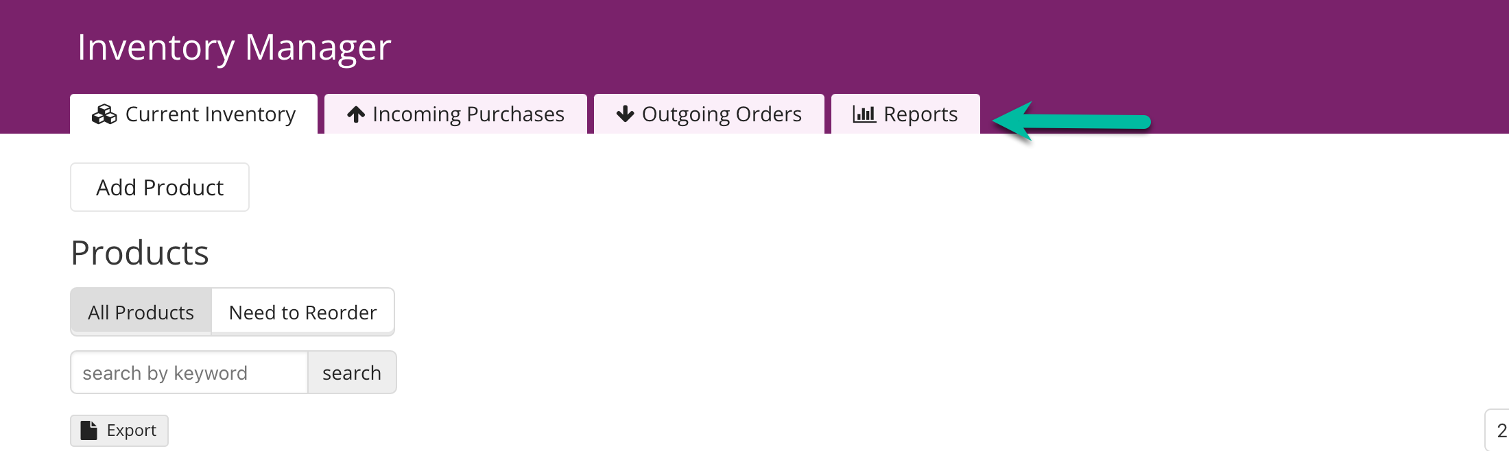
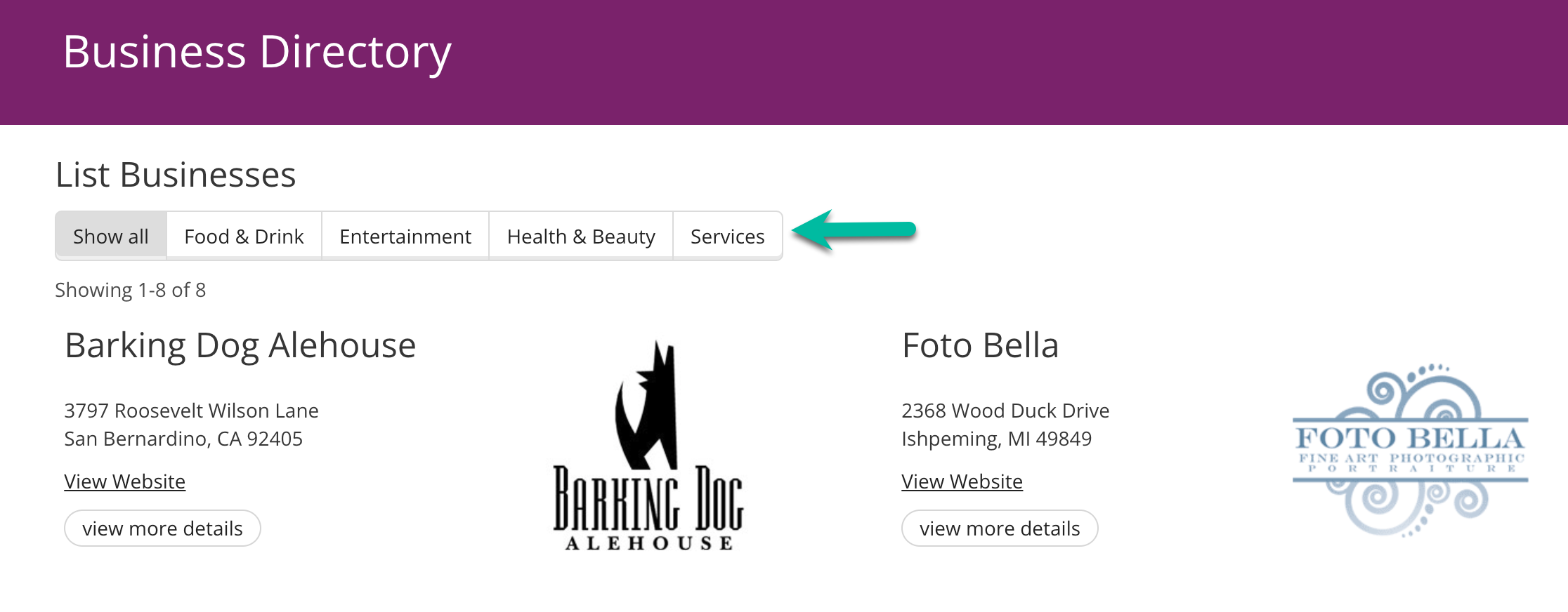
Page Menu
Page menus are the large menus located at the top of your applications, featuring links to each starting page. You have the freedom to add an icon to any page within the page menu.
To incorporate an icon into a page in the page menu, simply choose the desired page from the Pages section of the Knack builder. Then, access the "Settings" tab located in the top menu or click on the Settings option next to the page name.
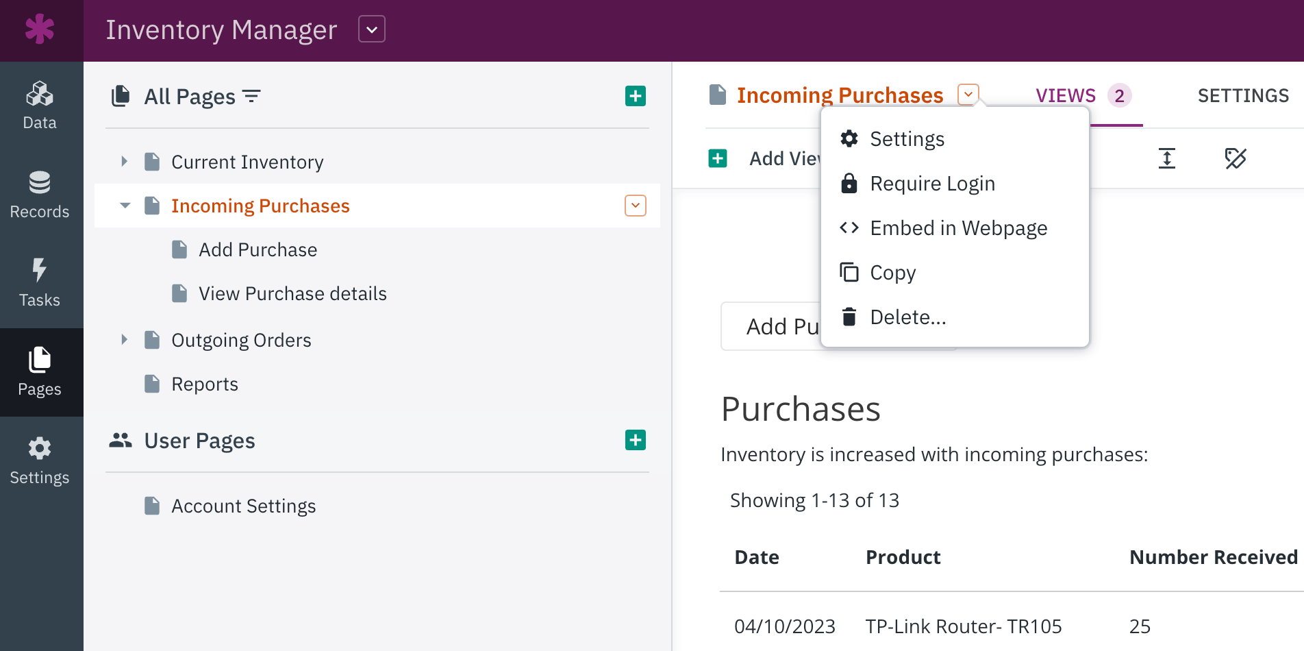
This will open the Settings for that specific page, giving you the option to easily add an icon.
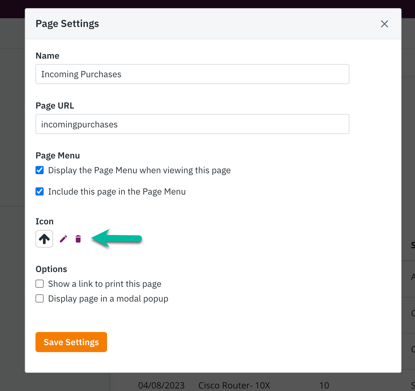
A popup will appear, giving you the option to select from a variety of icons and adjust the alignment of the icon.
You have the flexibility to choose whether the icon should be aligned to the left or right side of the button text.
Tip: For additional information on working with page menus, please refer to our comprehensive guide here.
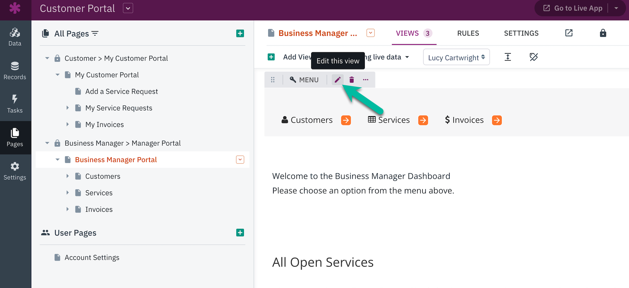
Menu View
Menu views provide you with the ability to include button or tab menus that link to other pages in your application or external URLs. You can easily incorporate icons when adding or editing a link while editing a Menu view.
To edit the view, simply click on the pencil icon located to the right of the view name, similar to other view types.
While editing the view, from within the "Add Links" section, you can select to link to a new page, link to an existing page, or link to a URL. After selecting one of the three options, you will be able to choose to add an icon.
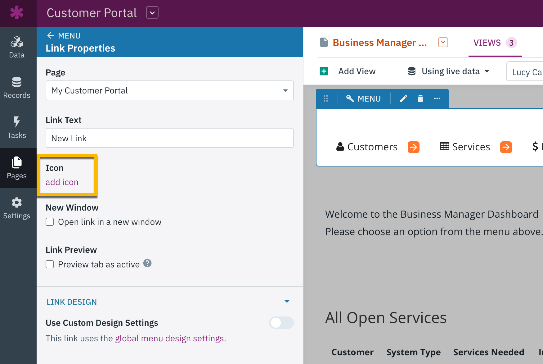
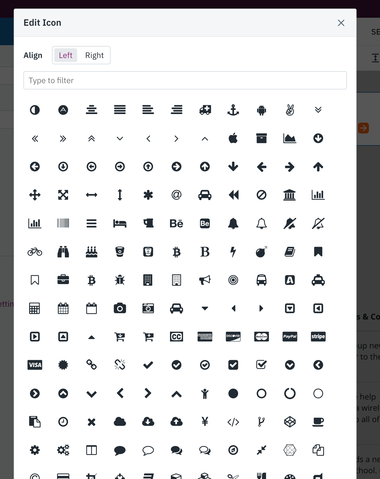
After selecting "add icon", a modal pop-up will appear where you can choose the desired icon to use.
Grid & Search Views
Icons can also be utilized in Grids and Search views, which are specifically designed to showcase multiple records in your application. By implementing display rules based on the record values, you can effortlessly incorporate icons into the grid columns of these views.
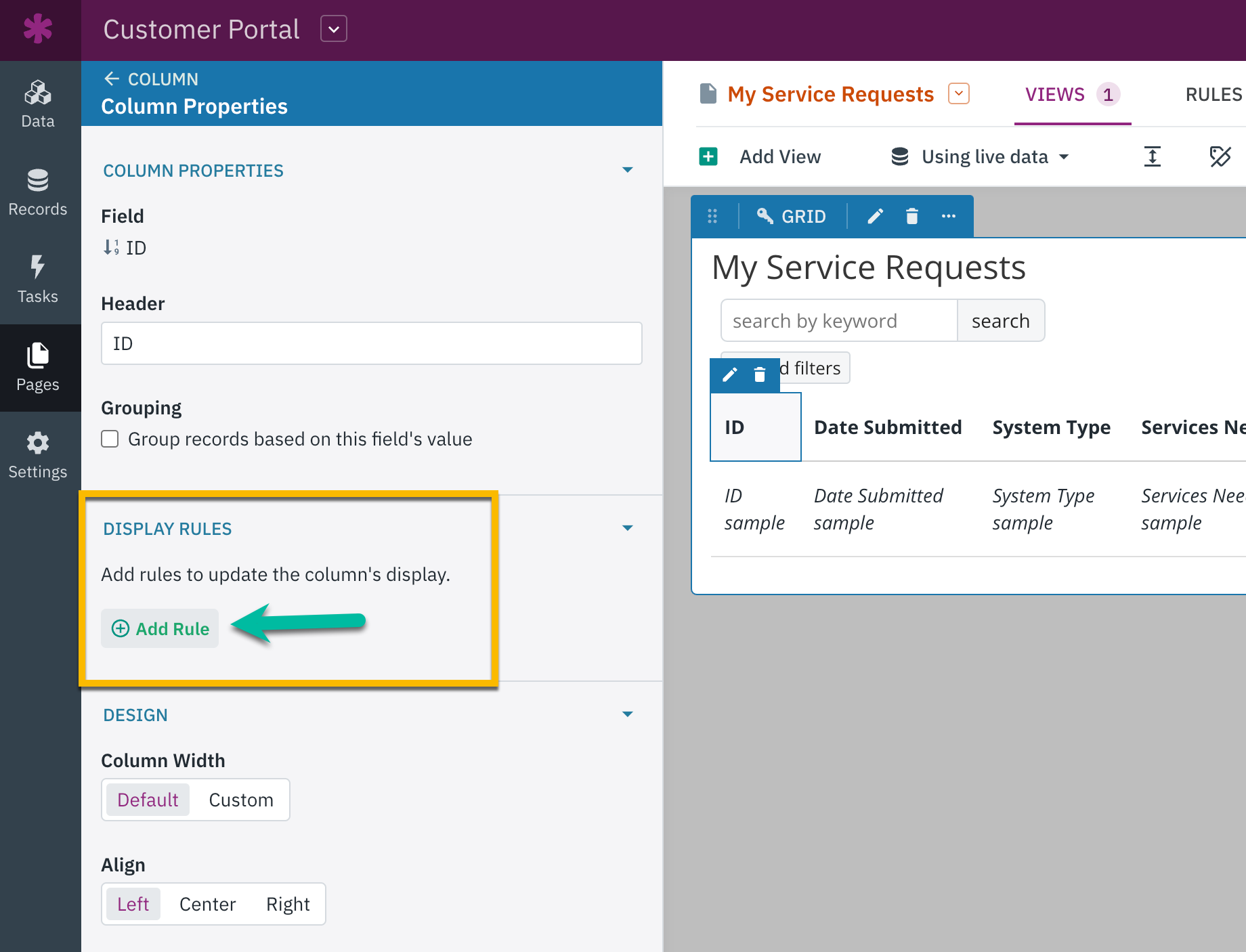
Grid Columns
To add icons to your grid columns, select to edit the view. In the view editor, hover over a column to select the edit icon:
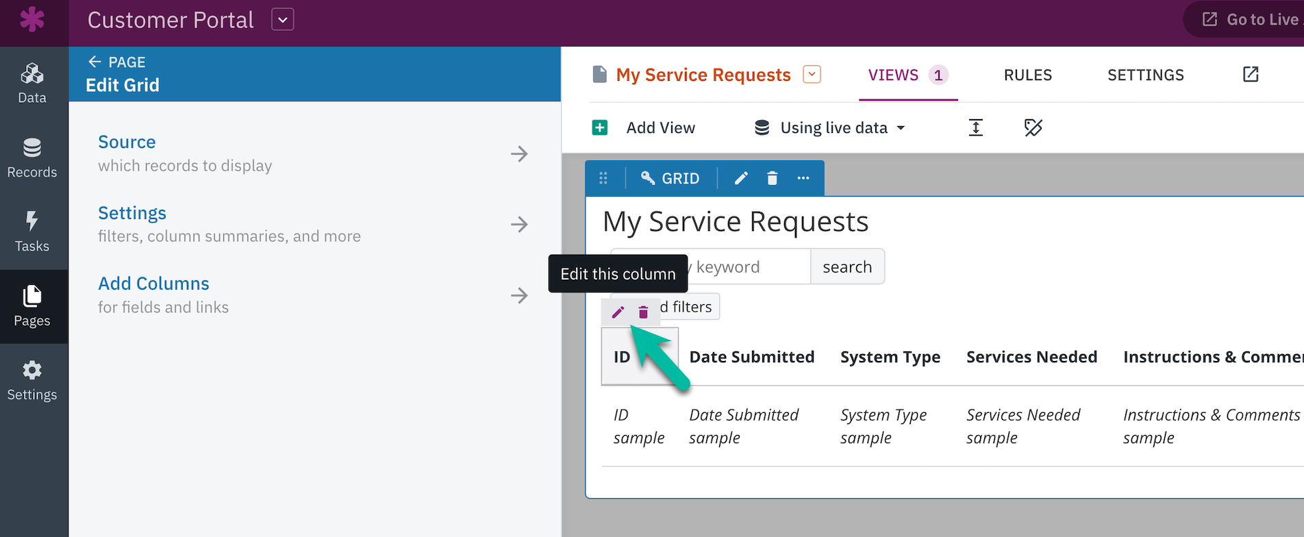
From there, you can select "Add Rule" under the Display Rules section:
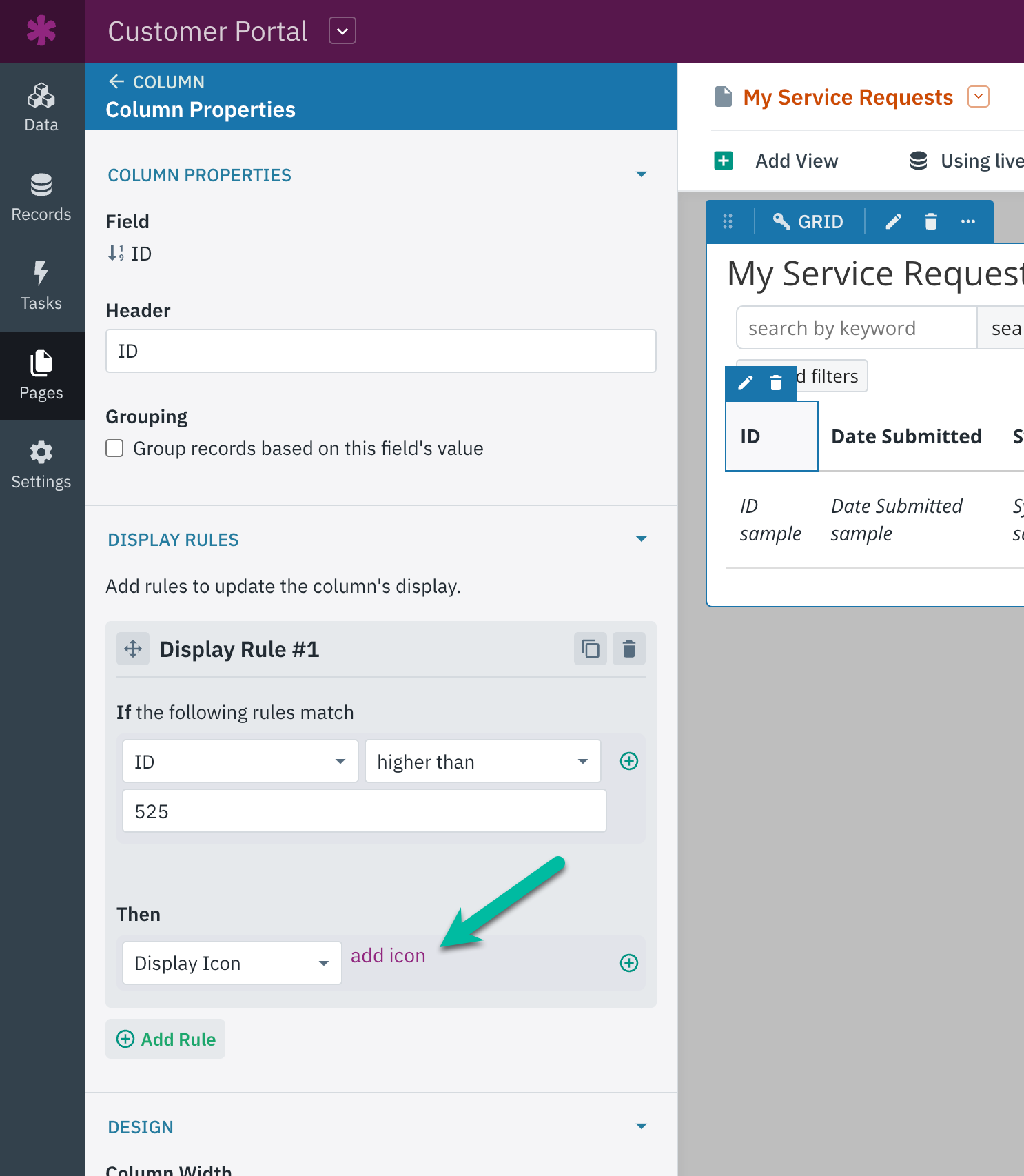
There are two sections to a rule, "If" and "Then":
- If: Use the "If" section of the rule to define when the icon will be displayed.
- Then: Specifies what will be displayed when the "If" statement is true.
You can easily add multiple display rules by selecting either the "Add Rule" button.
To display an icon, simply select "Display Icon" from the dropdown list in the "Then" section.
View Links
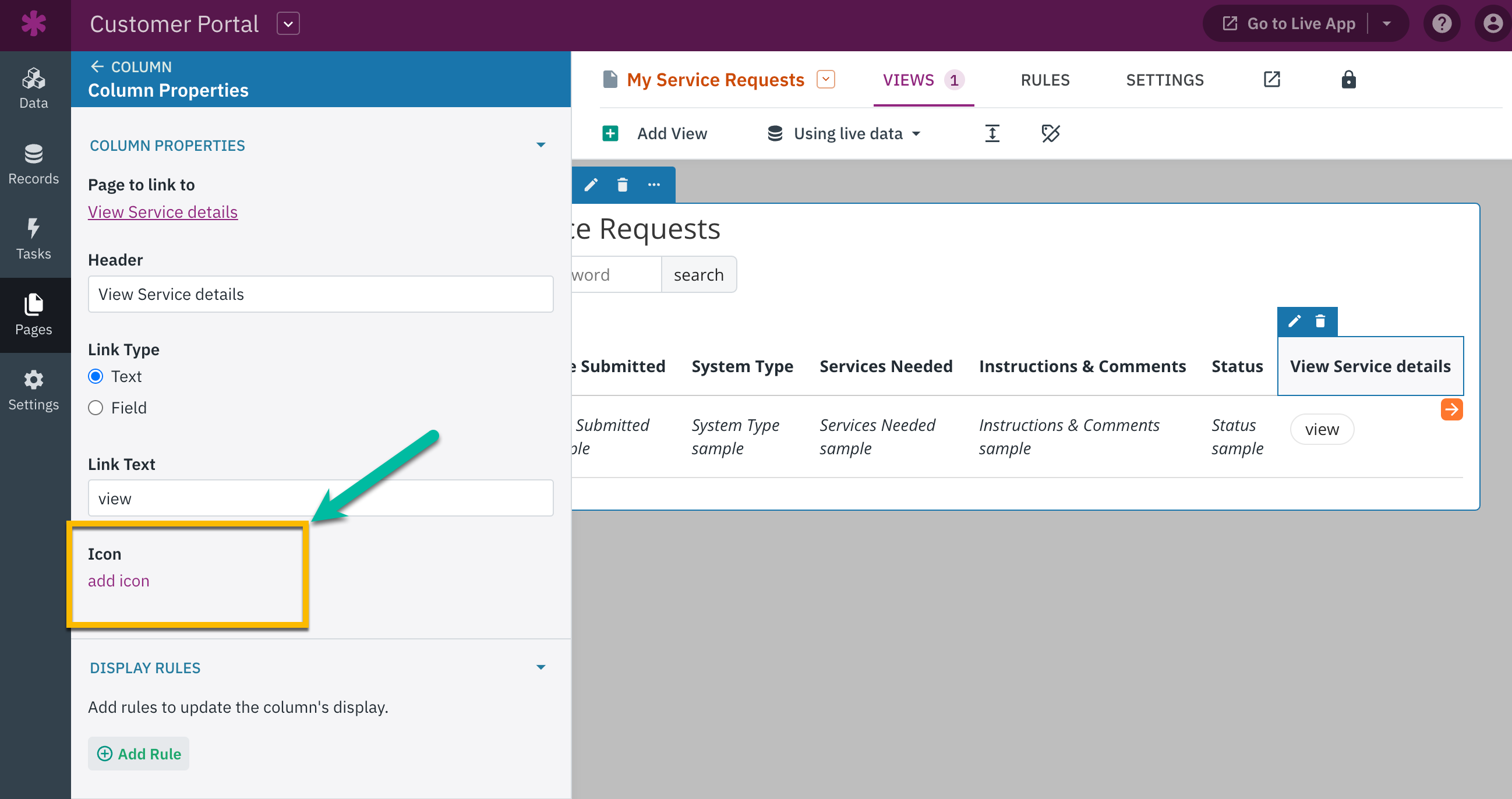
Icons can also be added to columns that have special links, such as links to view more details, edit, delete, or navigate to another page.
To edit a view using a grid, simply hover over the columns that contain the link and click on the pen icon to access the column settings.
In the "Properties" section of the column settings, you can simply select "add icon" to easily incorporate an icon into the column link.
Tip: To learn more about Grid and Search views, see the following articles:
Other Views
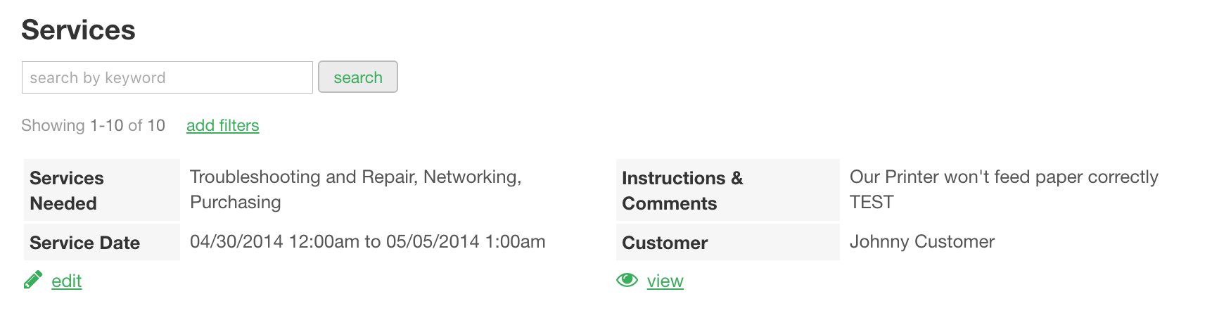
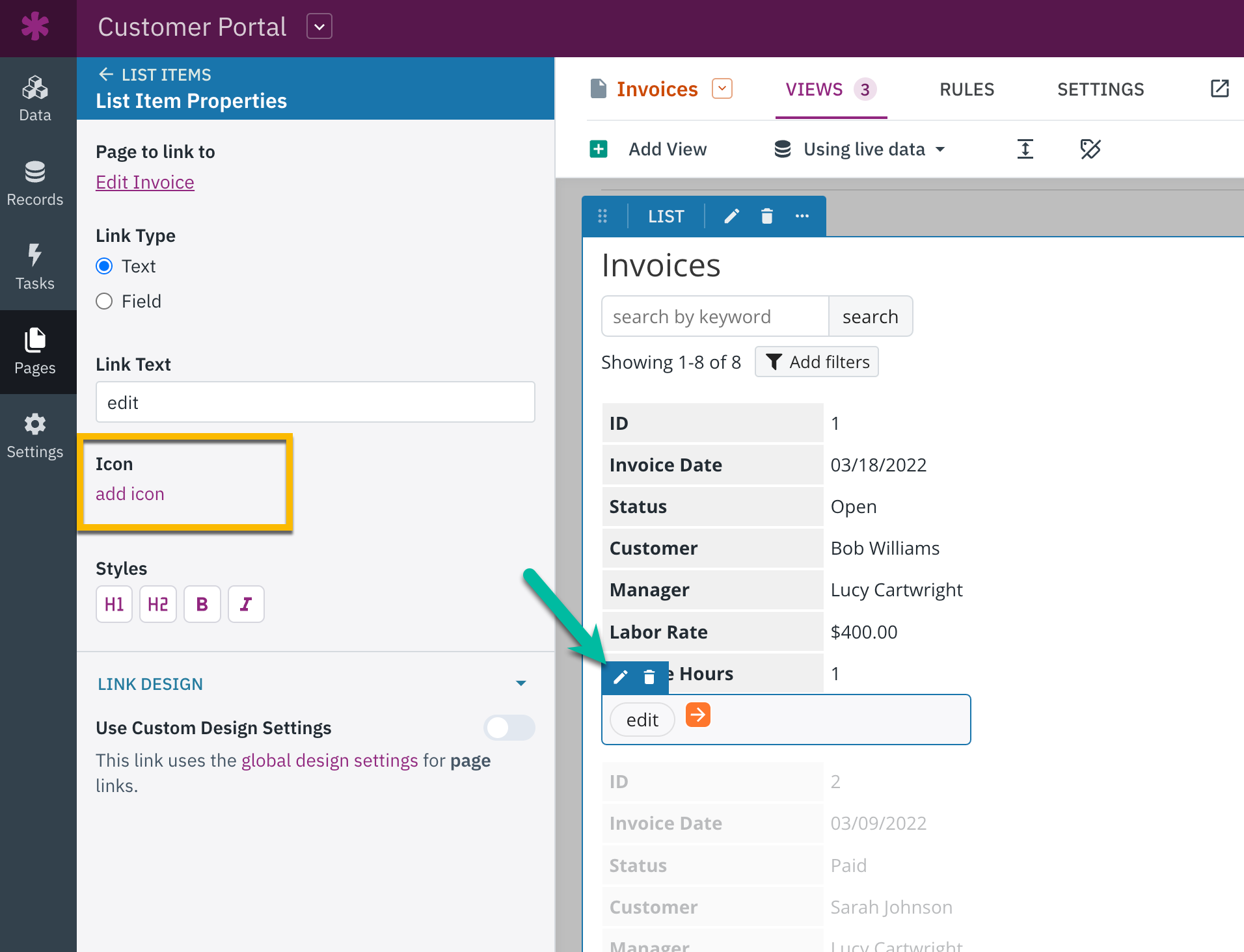
Icons can be incorporated into special links within List, Detail, Calendar, and Map views as well. These links enable users to access additional details, make edits, delete items, and navigate to other pages.
Here, you can take a look at these links in a list view, complete with icons.
When editing these view types, you have the ability to include links by accessing the "Column Properties" section. These links will then be added as separate fields within the view.
To incorporate an icon into these views, simply select the desired view from the Pages section of the Knack Builder to access the settings. Next, hover over the link you want to add an icon to in the view preview and click on the pen icon to edit the link.
Tip: Click the following links to find more information about List, Detail, Calendar, and Map views.